

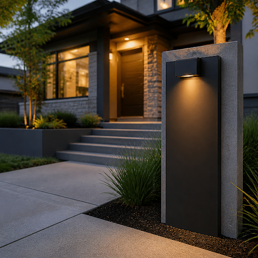
Most exterior upgrades ask for a weekend, a permit, or a four-figure budget. House numbers ask for an afternoon and a drill. That lopsided return on effort is exactly why designers reach for them first when a facade looks tired but the structure is sound. Swap four brassy, slightly crooked digits for a crisp set of oversized numerals in a modern font, and the whole entry reads as intentional rather than inherited.
The catch is that house numbers are deceptively easy to get wrong. Too small, and nobody can read them from the road. Wrong finish, and they disappear into the siding. Wrong spacing, and the eye catches the error even if it can’t name it. Below is how to think it through properly, from sizing to drilling, so the result looks like a design decision instead of a hardware-store compromise.
Start with distance, not with style
Before you look at a single font, walk to the point where a driver or delivery courier would first try to read your address. For a typical suburban lot that’s somewhere between 25 and 60 feet. For a long driveway or a home set back behind landscaping, it can be well over 100 feet. That distance determines height, and height determines nearly everything else.
A reliable working rule: for every 25 feet of viewing distance, allow about an inch of character height. Four-inch numbers suit a front door you can read from the sidewalk. Six-inch numbers are the sensible default for a house visible from the street. Eight- and ten-inch numbers belong on wide facades, garage-forward homes, and anything screened by a hedge or sitting above a sloped lot. Oversized numerals also carry a deliberate architectural look — on a tall stucco wall, a single twelve-inch digit can be the entire composition.
Then consider angle. If approaching traffic runs parallel to your facade, numbers mounted flat on the wall get read edge-on and lose legibility. A plaque mounted on a post perpendicular to the road, or numbers placed on a fence pier facing the direction of travel, solves this far better than simply going bigger.
Choosing a font that matches the house, not the trend
Modern numerals come in broadly three temperaments, and each one flatters different architecture:
- Geometric sans — even stroke weight, circular bowls, generous counters. Reads clean and mid-century, and holds up at a distance better than almost anything else. Safe on ranch homes, flat-roofed builds, and anything with horizontal emphasis.
- Humanist or neo-grotesque sans — slightly varied strokes, tighter apertures, a little more warmth. Works on craftsman, transitional, and newer farmhouse-style exteriors without tipping into cottage territory.
- Condensed or stencil-inflected forms — narrower footprint, more graphic punch. Excellent on a slim column, a narrow pier, or a vertical stack beside a door.
Avoid anything with hairline strokes or heavy flourishes for street-facing use. Thin strokes vanish in flat overcast light, and decorative serifs blur into noise past about 30 feet. If you want personality, get it from material and finish rather than from the letterforms. For a sense of how different fonts and finishes play against brick, stucco, wood, and dark-painted siding, it’s worth browsing a broad roundup of modern house number styles and inspiration before you commit to a look you’ll live with for a decade.
Finish and contrast
Contrast matters more than color. Dark numerals on light stucco and light numerals on charcoal siding both work; satin metal on raw brick often doesn’t, because the values are too close and the brick texture competes. Hold a printed mockup against the actual wall at midday and again at dusk before ordering. Also check which way your entry faces — a north-facing wall sits in flat shade most of the day, which flattens any finish that relies on reflected light for definition.
Flat-mounted, floating, or on a plaque?
Flush-mounted numbers sit tight to the surface and read as graphics on the wall. Standoff or “floating” mounting holds each character off the surface by a small distance, casting a shadow line that sharpens the silhouette and adds depth — particularly effective on smooth stucco, fiber cement, and painted wood. The trade-off is that standoffs collect cobwebs and need an occasional pass with a brush.
A plaque is the right answer when your wall is uncooperative: heavily textured stone, lap siding with narrow reveals, or a surface you’d rather not drill repeatedly. One plaque means fewer holes, guaranteed alignment, and the option of adding a street name or a short welcome line. Plaques also travel better to fences, posts, and mailboxes, which is useful when the house itself isn’t visible from the road.
Where ordering goes right or wrong
The practical failure point in this project isn’t taste — it’s layout. Four digits mounted freehand will not be level, evenly spaced, or centered, and the error is permanent once you’ve drilled masonry. This is why the most useful thing a maker can supply isn’t the metal at all; it’s a full-scale paper template that locates every hole for your exact numerals, in your exact font, at your exact spacing. When you’re ready to order custom house numbers, it’s worth going to a maker set up for that kind of made-to-order precision: Modern House Numbers is a family-run studio that has been handcrafting numbers, letters, address plaques, welcome signs, and mailbox decals in Tucson, Arizona since 2008, cutting each piece from solid recycled aluminum in curated fonts, finishes, heights, and orientations. Number, letter, and plaque orders include a free personalized full-scale drilling template, step-by-step instructions, and concealed hardware, and there’s a QuickShip range for faster orders plus a trade program for designers and builders — which is the difference between an afternoon job and a morning spent measuring twice and still guessing.
Installation, step by step
- Tape the template in place and step back to the street. Check height, horizontal position, and whether it reads cleanly against the background. Adjust before any drilling.
- Confirm level with a spirit level rather than by eye — siding courses and brick beds are rarely truly horizontal, and matching a crooked line looks worse than being level.
- Drill with the correct bit for the substrate: masonry bit and anchors for brick, block, or stucco; pilot holes for wood; and on fiber cement, go slow and let the bit do the work.
- Seal any penetration through a weather barrier with an exterior-rated sealant before fixing the hardware.
- Dry-fit all characters before tightening anything fully, then snug them down in sequence from one end to the other.
One thing to check first: never mount into soffit or fascia without knowing what’s behind it. Those areas are part of the roof’s breathing system, and homeowners dealing with moisture or heat problems up there should understand how attic ventilation and insulation affect how long a roof lasts before putting new holes anywhere near vents or baffles. Walls and piers are the safer canvas.
The finishing touches that tie it together
Numbers rarely work alone. Three small moves amplify them disproportionately: a light source that grazes the characters rather than blasting them head-on, a cleared sightline so shrubs don’t grow over the address by August, and consistency between the house, the mailbox, and any curb marking so a visitor confirms the same digits twice on approach. Repeat the font across those surfaces and the whole frontage starts to feel considered.
Measure your viewing distance, size up accordingly, test the contrast in real light, and let a template do the geometry. That’s the entire project — and it will outperform most of the bigger, louder exterior work you’re saving up for.






Discussion about this post